Classic Color Schemes
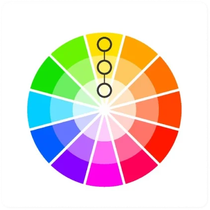
Monochromatic Color Scheme
The monochromatic color scheme uses variations in lightness and saturation of a single color. This scheme looks clean and elegant. Monochromatic colors go well together, producing a soothing effect. The monochromatic scheme is very easy on the eyes, especially with blue or green hues. You can use it to establish an overall mood. The primary color can be integrated with neutral colors such as black, white, or gray. However, it can be difficult, when using this scheme, to highlight the most important elements.`
Pros:
The monochromatic scheme is easy to manage, and always looks balanced and visually appealing.
Cons:
This scheme lacks color contrast. It is not as vibrant as the complementary scheme.
Tips:
- Use tints, shades, and tones of the keycolor to enhance the scheme.
- Try the analogous scheme; it offers more nuances while retaining the simplicity and elegance of the monochromatic scheme.
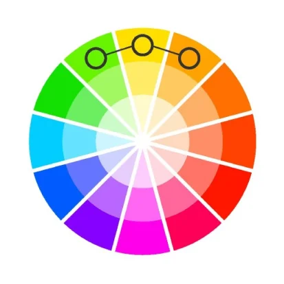
Analogous color scheme:
The analogous color scheme uses colors that are adjacent to each other on the color wheel. One color is used as a dominant color while others are used to enrich the scheme. The analogous scheme is similar to the monochromatic one, but offers more nuances.
Pros:
The analogous color scheme is as easy to create as the monochromatic, but looks richer.
Cons:
he analogous color scheme lacks color contrast. It is not as vibrant as the complementary scheme.
Tips:
- Avoid using too many hues in the analogous scheme, because this may ruin the harmony.
- Avoid combining warm and cool colors in this scheme.
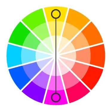
Complementary color scheme
When using the complementary scheme, it is important to choose a dominant color and use its complementary color for accents. Using one color for the background and its complementary color to highlight important elements, you will get color dominance combined with sharp color contrast.
Pros:
The complementary color scheme offers stronger contrast than any other color scheme, and draws maximum attention.
Cons:
This scheme is harder to balance than monochromatic and analogous schemes, especially when desaturated warm colors are used.
Tips:
- For best results, place cool colors against warm ones, for example, blue versus orange.
- If you use a warm color (red or yellow) as an accent, you can desaturate the opposite cool colors to put more emphasis on the warm colors.
- Avoid using desaturated warm colors (e.g. browns or dull yellows).
- Try the split complementary scheme; it is similar to the complementary scheme but offers more variety.
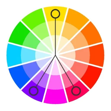
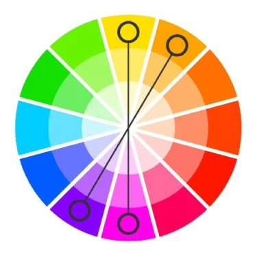
Split complementary color scheme:
The split complementary scheme is a variation of the standard complementary scheme. It uses a color and the two colors adjacent to its complementary. This provides high contrast without the strong tension of the complementary scheme.
Pros:
The split complementary scheme offers more nuances than the complementary scheme while retaining strong visual contrast.
Cons:
The split complementary scheme is harder to balance than monochromatic and analogous color schemes.
Tips:
- Use a single warm color against a range of cool colors to put an emphasis on the warm color (red versus blues and blue-greens, or orange versus blues and blue-violets).
- Avoid using desaturated warm colors (e.g. browns or dull yellows), because this may ruin the scheme.
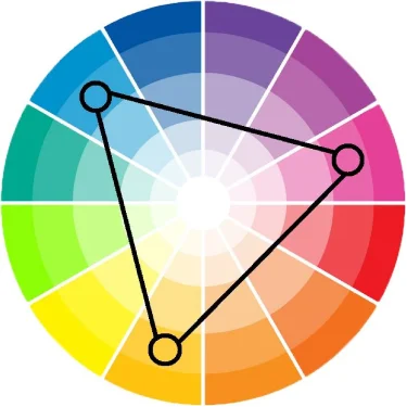
Triadic color scheme:
The triadic color scheme uses three colors equally spaced around the color wheel. This scheme is popular among artists because it offers strong visual contrast while retaining balance, and color richness. The triadic scheme is not as contrasting as the complementary scheme, but it looks more balanced and harmonious.
Pros:
The triadic color scheme offers high contrast while retaining harmony.
Cons:
The triadic color scheme is not as contrasting as the complementary scheme.
Tips:
- Choose one color to be used in larger amounts than others.
- If the colors look gaudy, try to subdue them.
Tetradic (double complementary) color scheme:
The tetradic (double complementary) scheme is the richest of all the schemes because it uses four colors arranged into two complementary color pairs. This scheme is hard to harmonize; if all four colors are used in equal amounts, the scheme may look unbalanced, so you should choose a color to be dominant or subdue the colors.
Pros:
The tetradic scheme offers more color variety than any other scheme.
Cons:
This scheme is the hardest scheme to balance.
Tips:
- If the scheme looks unbalanced, try to subdue one or more colors.
- Avoid using pure colors in equal amounts.